Choosing Simple
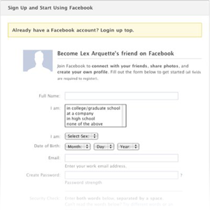
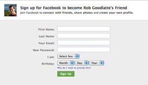
Often the role of a product designer is best described as janitorial. I recently had the pleasure of cleaning up one of Facebook’s most important pages — our registration page. The requirements of the page changed over time, leading to a lot of inconsistency and duplication. Changes to the page were made piecemeal — support for Facebook platform one week, public profiles another week, invitations the next. The result was a complicated interface for something that should be simple.


The re-designed version is decidedly simple. The new design is unremarkable, boring, commonplace — these are attributes we pursued. It’s so simple that the initial design took about 30 minutes — most of which was spent debating different header treatments. It is designed to be completely invisible — a super normal registration interface. It’s only worthy of remark because it was incredibly effective. We saw a noticeable increase in our registration rate compared to the old page. As designers, we often pursue radical departures from simple. We search for a solution that re-thinks everything. That thinking is valuable — it let’s us make paradigm shifts when needed. But the solution that anyone could have designed, the simple solution, is usually the best. The hard part is choosing it. Props to Lex Arquette for helping me build the new registration page. The simplest designs are often the hardest to build right. Cross-posted from Facebook Design