Re-Designing Slashdot
Published 3 years ago, mid-May under Design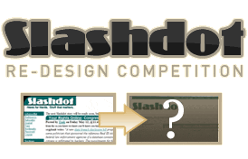 Two weeks ago, Rob Malda (better known as CmdrTaco), announced the Slashdot CSS Redesign Contest, a contest to overhaul the 1997-style slashdot.org user interface. The lucky winner shall receive a very pricey laptop, but more importantly, the opportunity to add one of the most trafficked sites on the net to his or her portfolio. The competition is plentiful, but I couldn’t resist trying my hand at redesigning a veritable icon of the web. Plus, I really want a MacBook Pro!
I’ve been a longtime reader of Slashdot, and despite it’s kludgy interface and odd colors, I’ve grown accustomed to it over time. So attempting a re-design was an odd and unique challenge. I didn’t want to produce a new look that would completely depart from Slashdot’s interesting style, but I also realized that Slashdot of my youth hasn’t aged well at all and is in many regards downright ugly.
Fortunately, I think CmdrTaco agrees with me on this. One of his criteria is as follows:
Retains some sense of visual continuity with Today’s Slashdot - This one is the real challenge I think. From the Slashdot ‘Shade of Green’ (#006666) to the curve on the upper left hand corner of the page & article headers, to the use of the Coliseo font, I really think that many of these design elements need to persist. You are welcome to ignore me of course. But I’m being totally up front about this point: the winning entry ought to echo the current design. How loud of an echo is up to you.
With that in mind, I started sketching out layouts. Knowing I would ideally retain the use of the Coliseo font, I first tried integrating the font with some simple logo marks. I tried creating many variations on rounded rectangles with an exaggerated upper left curvature, often with “/.” inside, but these invariably looked ugly. In the end, I decided that no logo mark was needed - the uniqueness of the Coliseo font is more than enough branding for this classic site. There’s no need to befuddle a solid, recognizable brand with a dumb logo mark. I set the font a bit larger than the current design, ditched the drop shadow, and added a very subtle gradient and even subtler reflection (damn I’m trendy, aren’t I?).
Next, I played around with some layout options. One novel idea I had was to separate the stories into two columns, which would decrease the length of the page and make the site read more like a newspaper. The first story on the page (chronologically) would show at full width, and subsequent stories would lose the “slashbox” encapsulating the title, opting for a simple light grey backdrop.
If you’ve gone ahead and peeked at my design, I obviously decided not to go with this idea. It simply didn’t work in the execution stage. I got as far as a photoshop comp and some HTML, then figured out that the column idea just didn’t work. Sometimes an idea is just flat out bad - this was one of those ideas.
Finally, I focused on the navigation. The first thing I did was to re-position the user info / login navigations links to somewhere else on the page. I chose to create a top navigation bar for these, which would display preference options to logged in users and drive users who aren’t logged in to login. Other than that, I cleaned up the navigation quite a bit. I spaced out the links a bit, set them in Georgia to distinguish them from the rest of the page, and embellished the navigation headers with a 3px stroke above them (in Slashdot green of course).
So what did I change? Not much at all. Perhaps I simply revere Slashdot too much, but I didn’t want to produce something too far from the current design. Much of my re-design was simply polishing the existing Slashdot interface to be cleaner, friendlier, and easier to read.
The Big Reveal
http://robgoodlatte.com/slashdot

So there you have it. It’s not much of a departure from the current design - it’s more like a visual refresh. I would love to hear any feedback or suggestions on how I can improve my design. It will be continually modified until I reach satisfaction or until next Wednesday arrives.
A Few Notes:
1. The whitespace at the top is to be filled with an ad (a 468 x 60 banner preferably, although a super banner could fit if needed).
2. This design is still a work-in-progress. Thankfully the contest allows tweaks throughout the whole process, so expect things to change. One thing I would like to add is a more elegant footer.
3. I still need to create some sub-pages.
Update - Sunday May 14: I’ve tweaked the home page design slightly by adding small tag icons and slightly re-organizing the home page.
I’ll upload a page showing comments later tonight as well.
Update - Tuesday May 16: Article Detail / Comments page added

I think you’re on to something here.
I really like how you’ve cleaned up the navigation area: you should continue to do the same with the content area. Can’t wait to see more.
Great start.
When I first heard about Slashdot’s redesign in April, I said to myself “Please no, don’t change Slash!”. But when I see your redesign, I might say that this is a new perspective for Slashdot and it has a future again, after Digg’s “preliminary” success.
Thanks for getting a more conservative entry up into the running. Seems like most everyone else wants to cover Slashdot in the web equivalent of chrome.
The entry looks great. This is just what Slashdot needs, a nice simple refresh without all the clutter and chrome like many of the other entries give.
I look forward to seeing the final product and good luck!
good luck with the contest! I like your style very much!